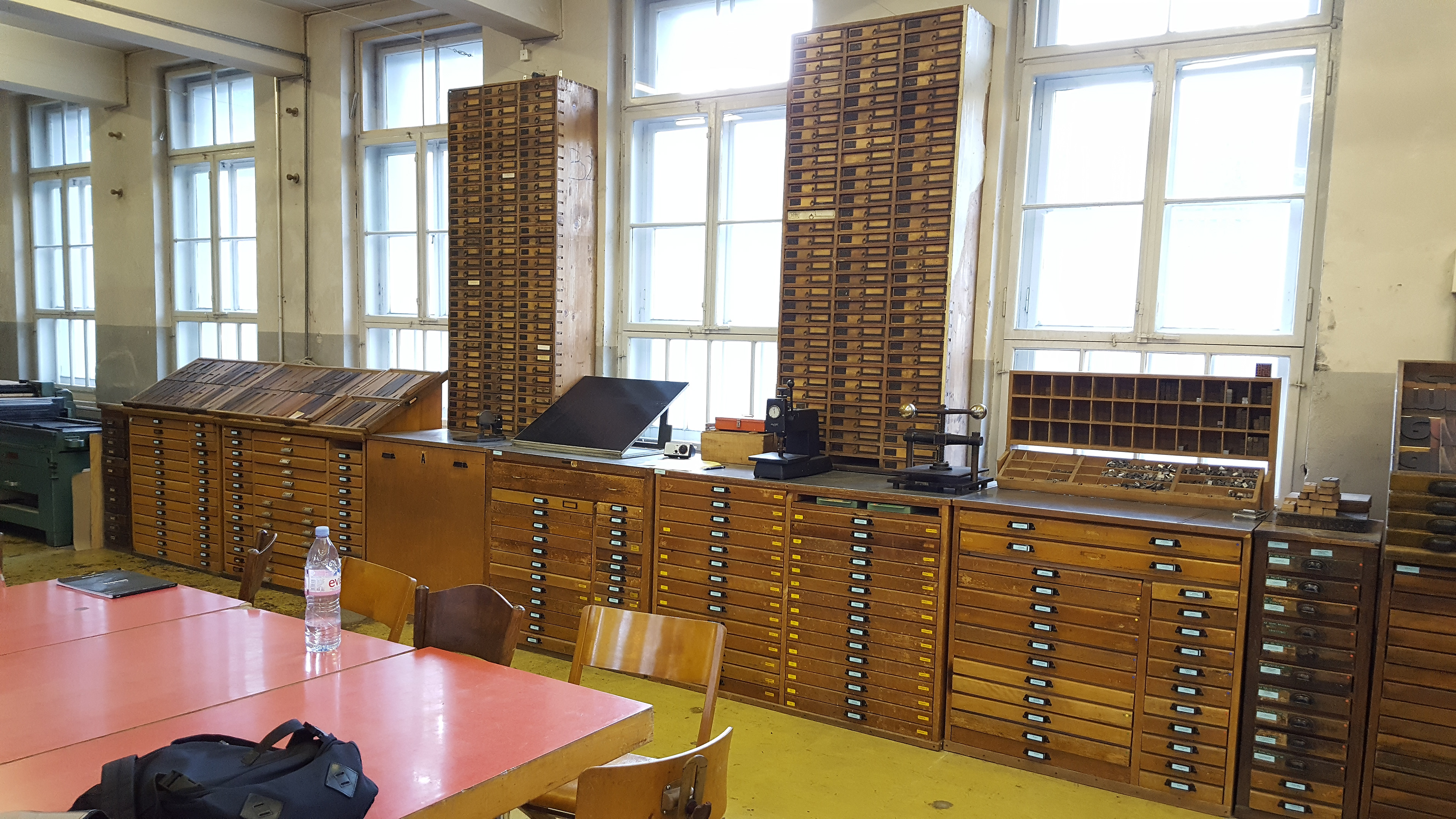
Dafi's workshop was filled nearly to the ceilings with shelves of all sorts of typefaces in varying sizes and weights.
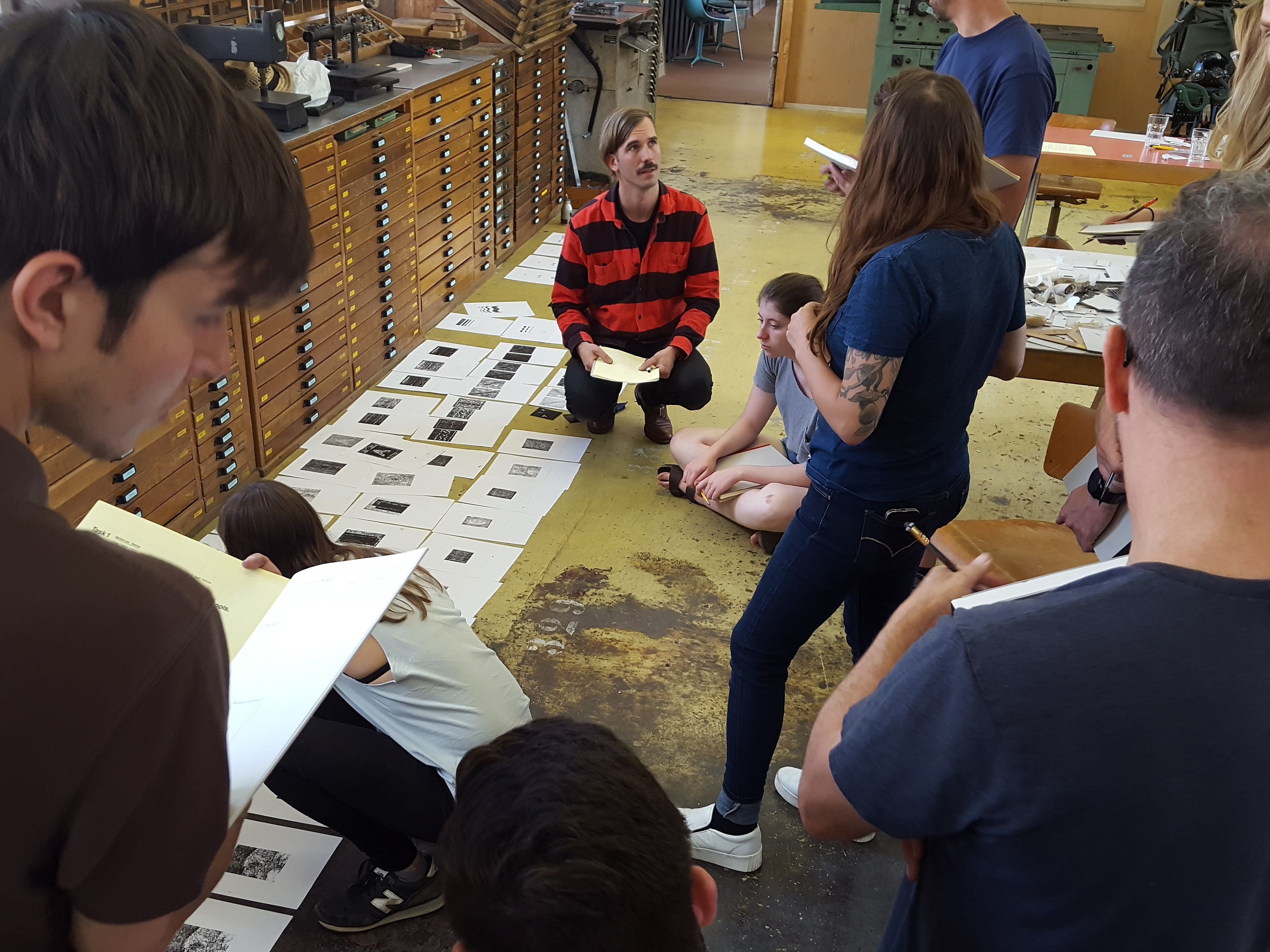
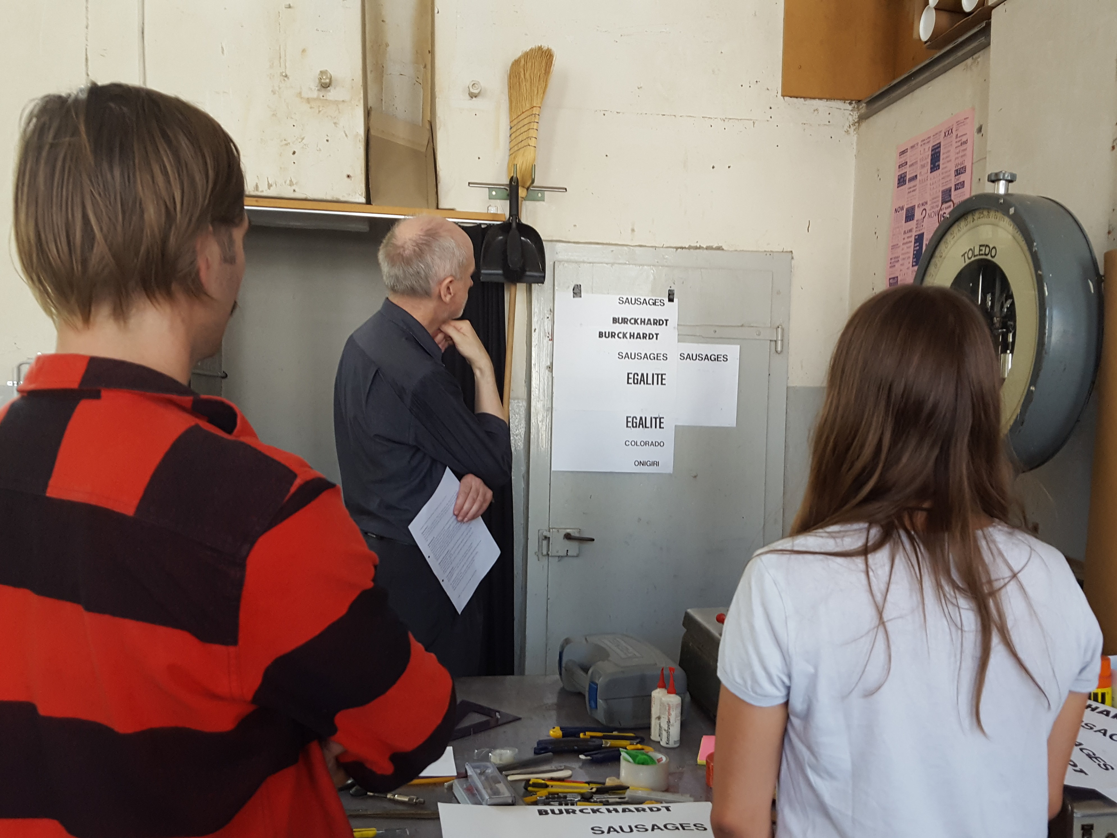
Much of the course work included group critiques led by Dafi Kuehne.
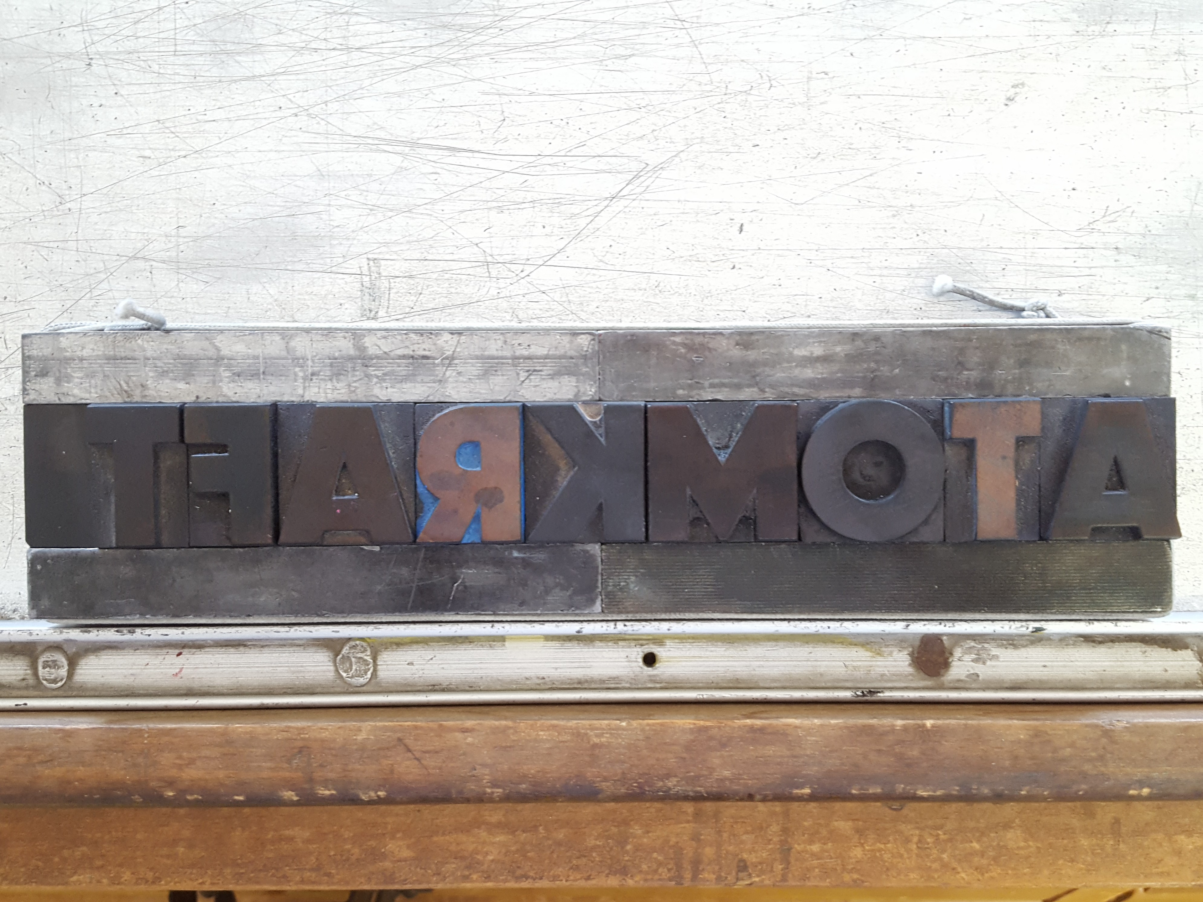
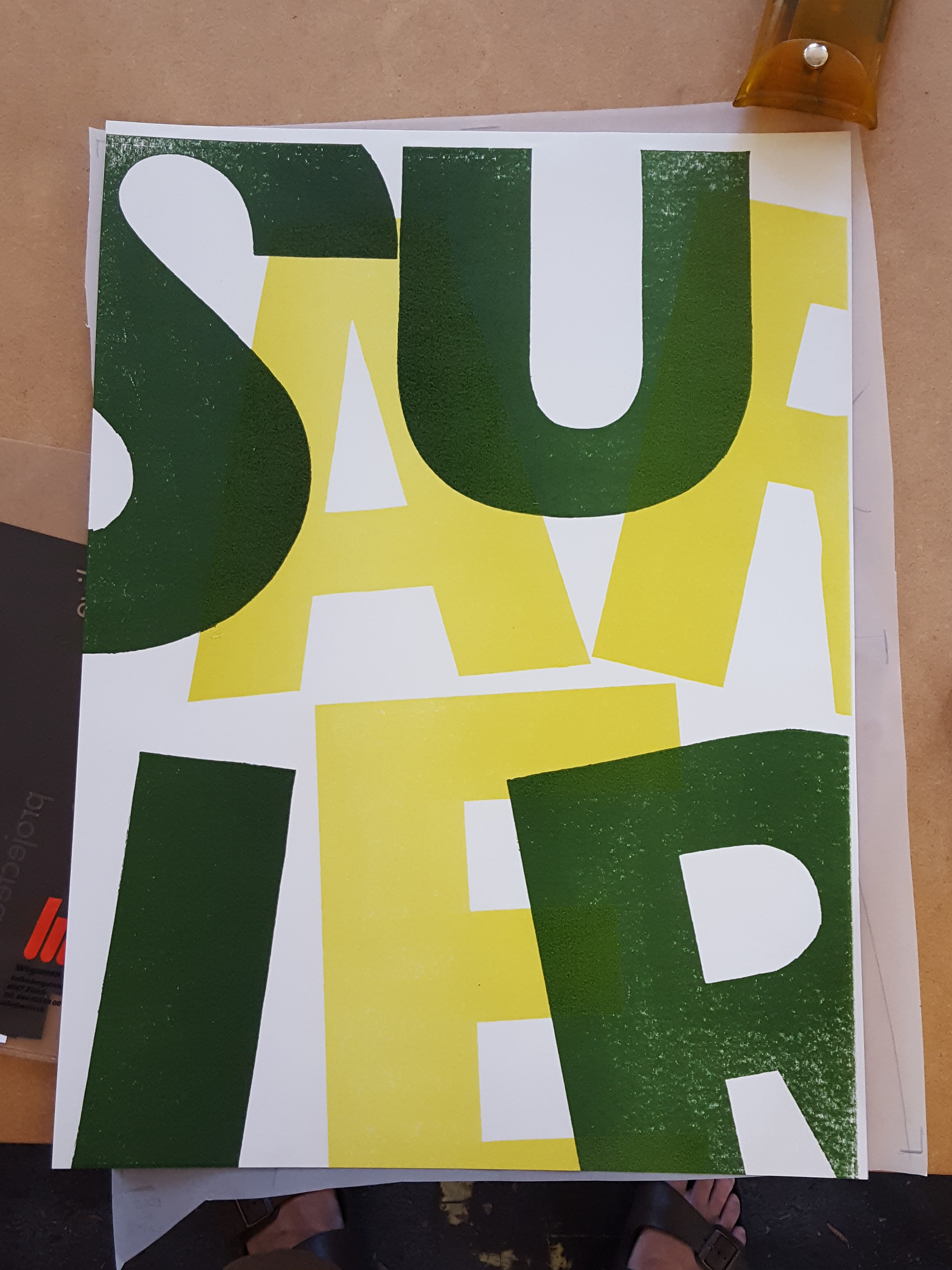
The first lesson was in microtypography, specifically the kerning of title text. We selected a word from 8-12 letters in length, and composed it in large type between 48-60 points in size. I chose a bold Grotesk to match my word selection, ATOMKRAFT (German for "atomic energy").
Dafi and Rudolf Barmettler assisting a student and giving critique on her work.
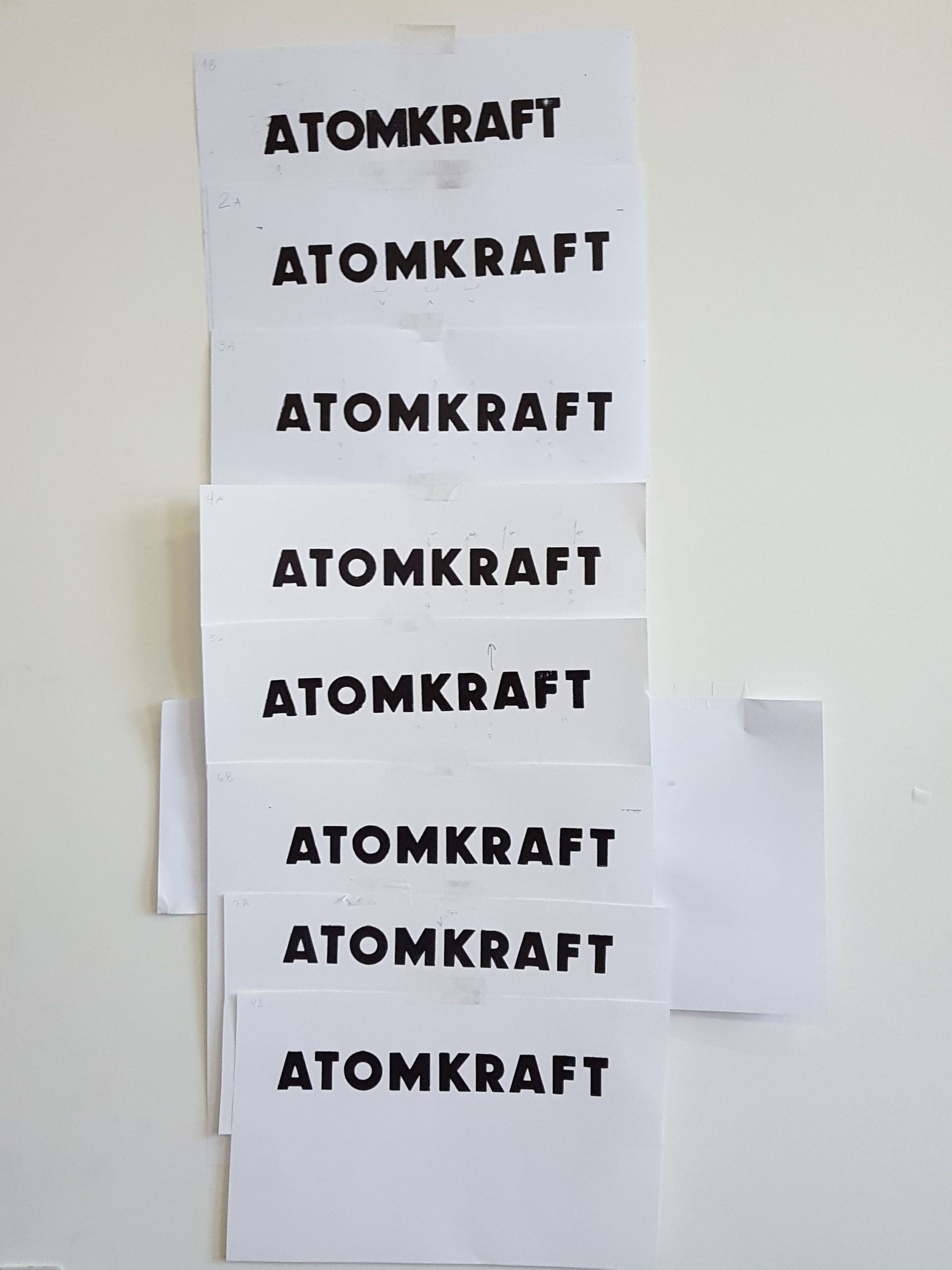
The series of prints, edits and reprints that I completed before eliciting satisfaction from my instructors.
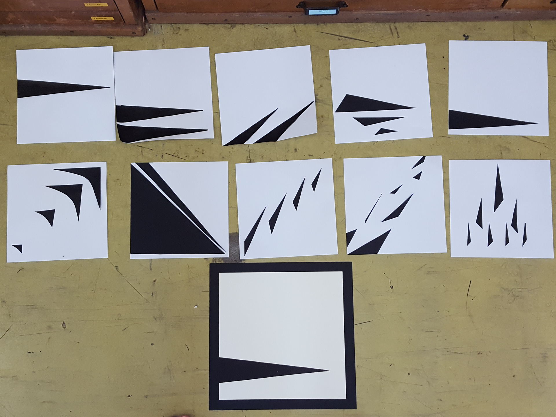
To take a break from typography, we spent a day reviewing design fundamentals. This is my result of the exercise of selecting an adjective and a shape from a list, then creating bulk quantities of sketches using markers or cut paper. By the end of the exercise, it was determined that among the best of my best concepts, the simplest one rose above the others.
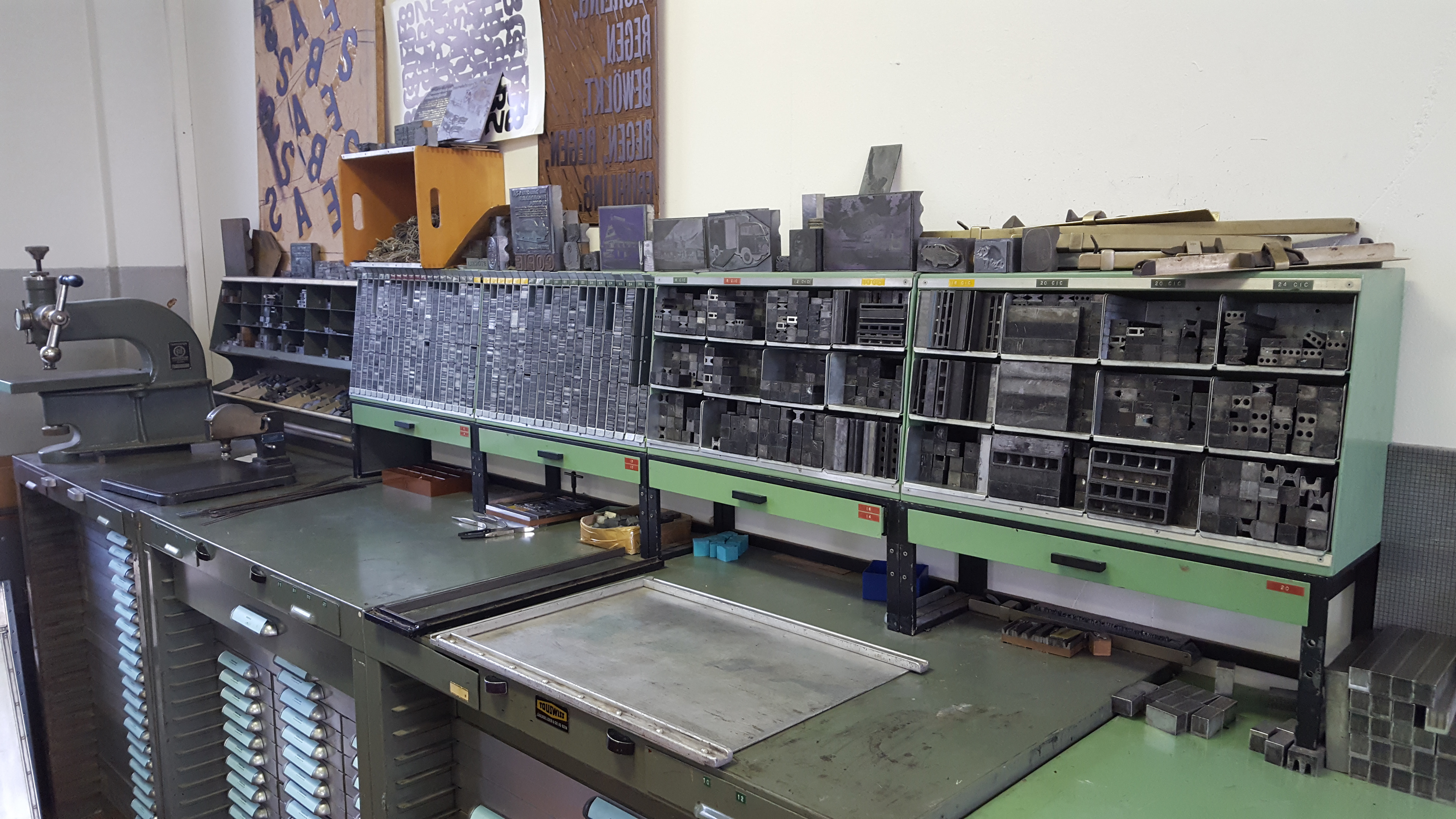
A look at the workspace for the day's project on macrotypography, or the layout of type on a scale between sentences and paragraphs. Our task involved taking a newspaper article and hand setting 5 lines of text in 12 points with a line width of 24 ciceros.
Our compositions were to be center justified like most newspaper text, as opposed to a left-aligned ragged-right that is commonly seen in other forms of publication. This meant we would fit as many words as possible onto a line, then mathematically divide the remaining spacing between them until each line was precisely 24 ciceros in length. Special care was to be given to spacing between the numbers in years, hyphenated phrases, and other elements that would stand out from typical text.
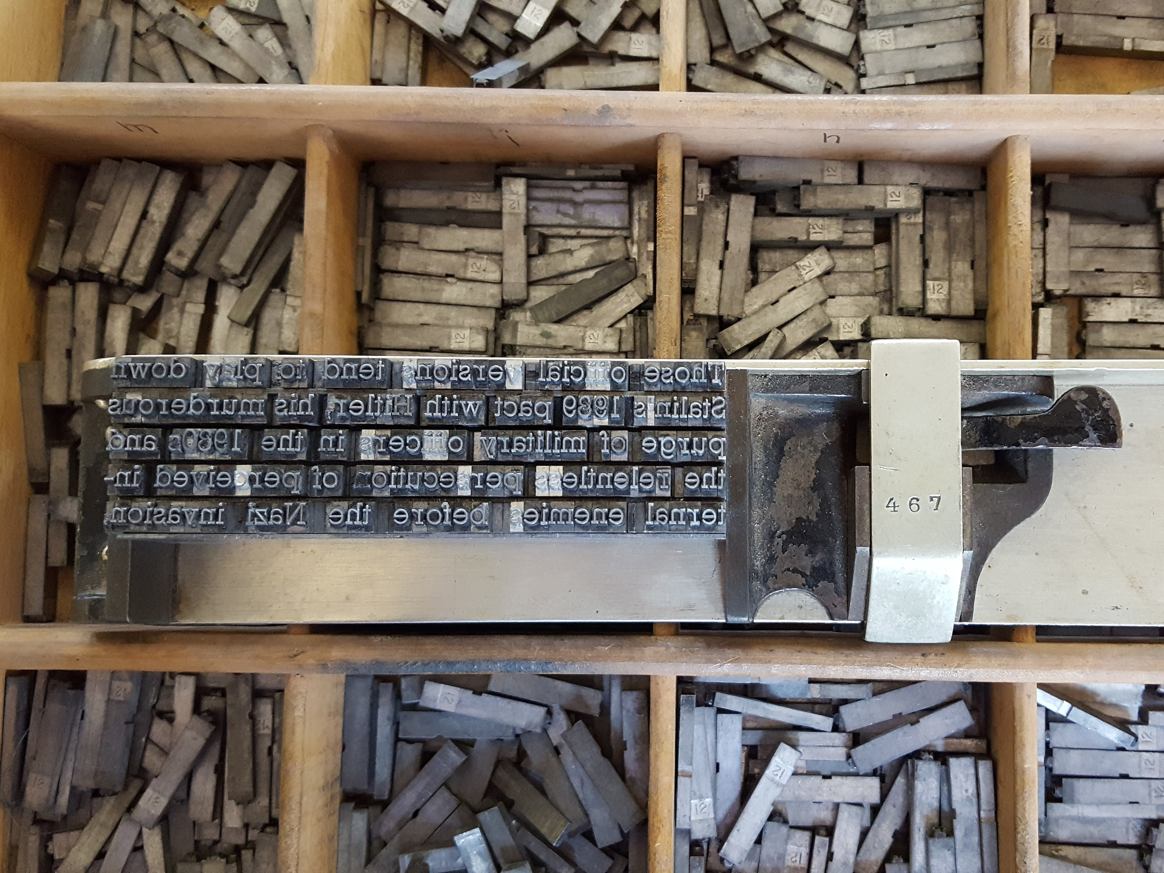
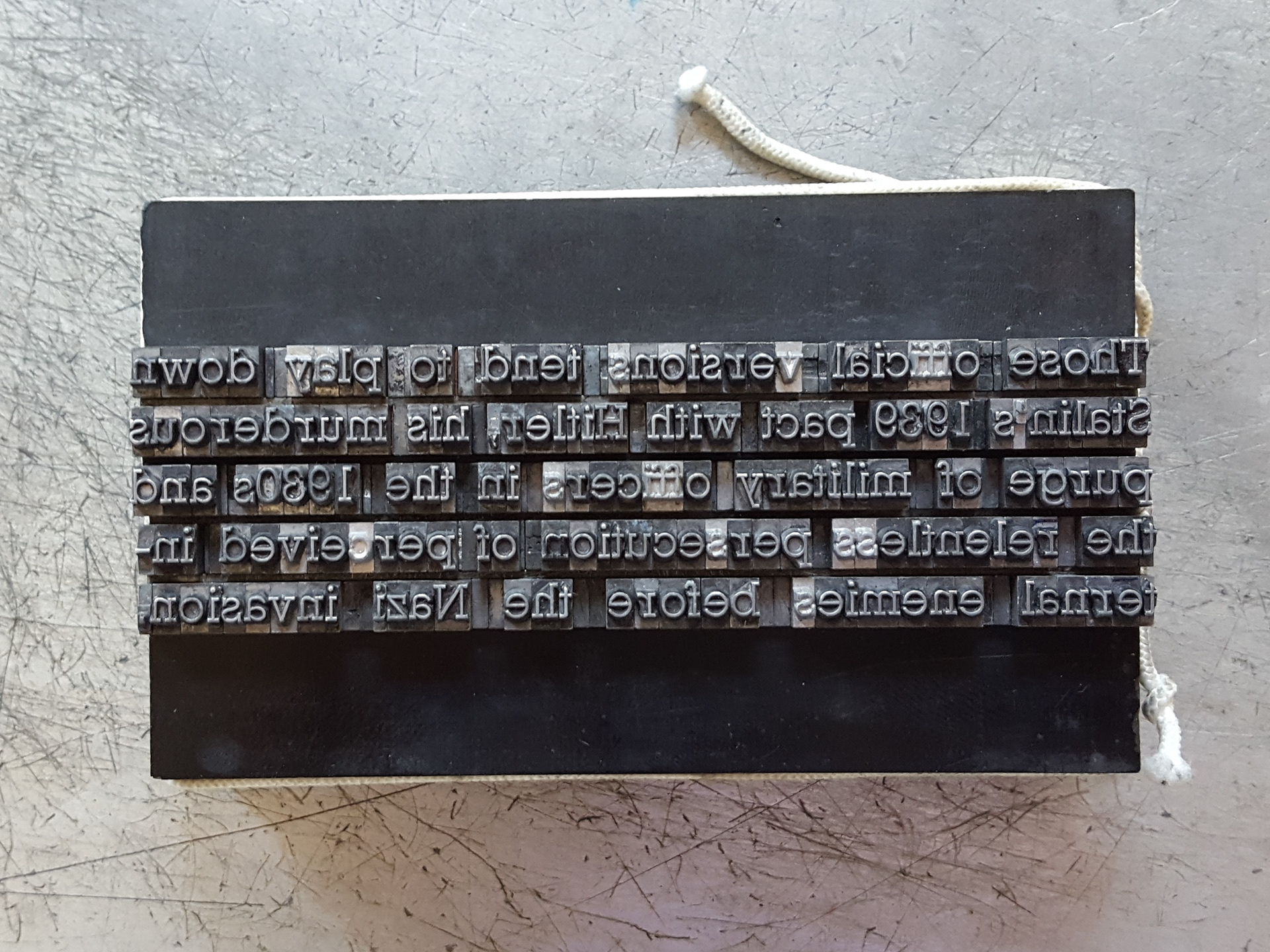
The type (very carefully) is transferred from the composing stick to a tray called a "galley," to be surrounded with the black pieces of plastic, called furniture, and wrapped with a piece of string. This holds them in place while in transit and in printing. It can now be removed from the galley and placed on the press for printing.
The result of printing my text block. A bit morbid, but pretty nonetheless when set in the typeface called Rockwell.
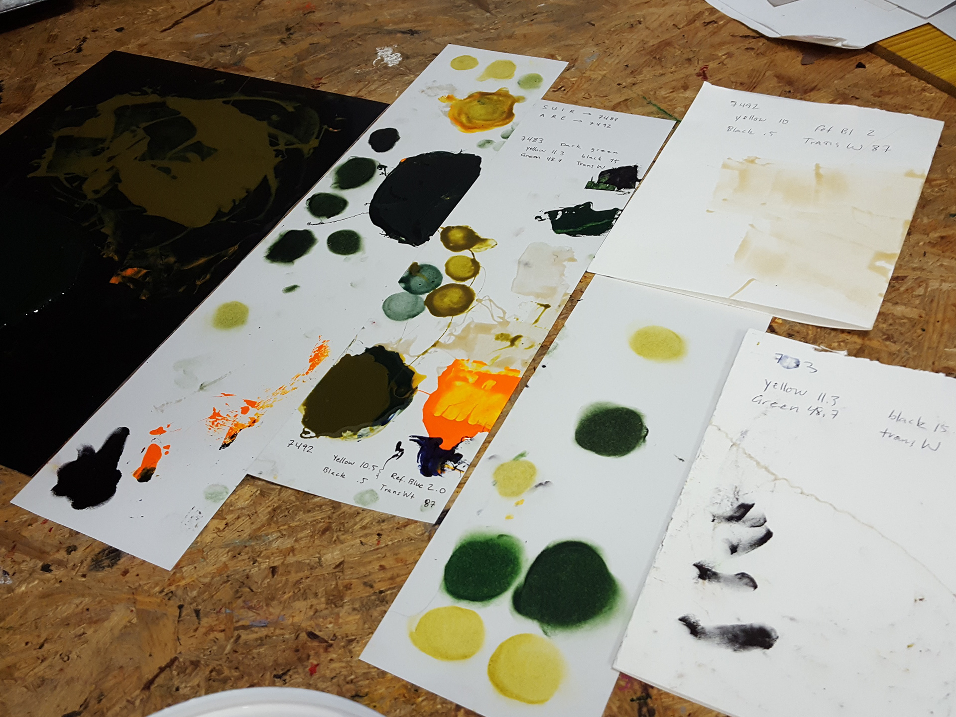
The process of mixing my ink colors. Adding minuscule amounts of pigment could drastically alter the resulting ink's color profile, so caution is required.
My poster after the first two of four runs on the press, with all the background characters in place and printed.